本文主要通过修改switch样式,记录一下如何修改elementUI样式。
引自https://blog.csdn.net/sleepwalker_1992/article/details/85763951
Element-UI的Switch 开关用法
http://element-cn.eleme.io/#/zh-CN/component/switch
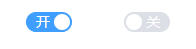
修改后的示意图
代码部分
1
2
3
4
5
6
7
8
9
10
11
12
13
14
15
16
17
18
19
20
21
22
23
|
<template>
  <div>
    <el-switch
      v-model="value"
      width="46"
      active-value="0"
      inactive-value="1"
      active-text="开"
      inactive-text="关">
    </el-switch>
  </div>
</template>

<script>
export default {
  data () {
    return {
      value: '0'
    };
  }
};
</script>
|
样式(修改Element-UI的Switch 开关的默认样式类):
1
2
3
4
5
6
7
8
9
10
11
12
13
14
15
16
| .el-switch__label--left{
position: relative;
left: 46px;
color: #fff;
z-index: -1111;
}
.el-switch__label--right{
position: relative;
right: 46px;
color: #fff;
z-index: -1111;
}
.el-switch__label.is-active{
z-index: 1111;
color: #fff;
}
|
打开关闭时的字体颜色不同
1
2
3
4
5
6
7
8
9
10
11
12
13
14
15
16
17
18
19
20
| .el-switch__label--left{
position: relative;
left: 46px;
color: #fff;
z-index: -1111;
}
.el-switch__label--right{
position: relative;
right: 46px;
color: #fff;
z-index: -1111;
}
.el-switch__label--right.is-active{
z-index: 1111;
color: #fff !important;
}
.el-switch__label--left.is-active{
z-index: 1111;
color: #9c9c9c !important;
}
|
小结
用ui组件总免不了需要对它做一些个性化定制的需求,所以我们就要覆盖element的一些样式。
首先我们要了解一下vue scoped是什么,很多人非常喜欢用scoped,其实scoped也没有很神秘的,它就是基于PostCss的,加了一个作用局的概念。
1
2
3
4
5
6
7
8
| // 编译前
.example {
color: red;
}
// 编译后
.example[_v-f3f3eg9] {
color: red;
}
|
它和我们传统的命名空间的方法避免css冲突没有什么本质性的区别。
现在我们来说说怎么覆盖element-ui样式。由于element-ui的样式我们是在全局引入的,所以你想在某个view里面覆盖它的样式就不能加scoped,但你又想只覆盖这个页面的element样式,你就可在它的父级加一个class,以用命名空间来解决问题。
1
2
3
4
5
| .aritle-page { // 你的命名空间
.el-tag { // element-ui 元素
margin-right: 0px;
}
}
|